A Modern Publication
for the Sexy Nerd


An online publication for the sexy nerd

NOVA
roles and constraints
My role:
UI/UX, Visual Designer, UX Writer
Tools:
Figma, Photoshop, Illustrator
Scope:
4 days
Feb, 2022 as part of a design course at Ironhack
My Role:
Competitive Analysis, Interviews, Card Sorting, User Research, Qualitative & Quantitative Analysis, User Journey, Information Architecture, Mobile and Desktop design, Usability study
overview
the problem
How might we help Elaine, our fictional user, think rationally, discover new passions and achieve a good work-life balance? These are issues that are very pervasive in a socitty that is success-drive, rather than happiness driven.
The solution:
Our goals to were to create an app and website that
1. enabled Elaine to feel connected to her community
2. kept her aware of global happenings and a way in which to contribute to causes
3. educate her about simple life-hacks that keep her healthy physically, mentally and spiritually.
the challenge
For this project, my partner and I were tasked with creating an online magazine to spice up the life of a busy, young, female professional. It was our aim to understand what peaked her curiosity along with what motivates her to take action.
My aim was to create a platform that educated Elaine about local events that would connect her to a community - which she seemed to be lacking - along with keeping her abreast of such topics from heath and wellness to global and world issues.
Finally, I wanted to understand the pain points Elaine and individuals in her cohort experience while navigating "self help" and information-based websites, and to consider that information upon the development of the publication.
let's get this party started
The development of our publication was based on an iterative process called the DESIGN THINKING process model. This method would allow us to truly empathize with our users based on ample reserach and creative problem solving and testing.
DESIGN THINKING PROCESS MODEL
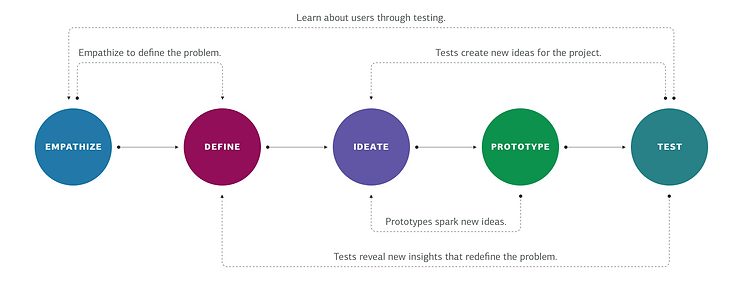
To begin our research, we chose four different methods to better understand our user and empathise with their needs.
reseach
1. competitive analysis
SWAT Method:
We were able to identify opportunities and threats in the current marketplace by studying Elaine's favorite publications along with studying some alternatie websites that catered to the topics she wished to learn more about or improve on.


Take Away:
It was clear that there was a void in the market. Based on our research, there wasnt a publication out there that hit Elaine's "sweet spot," one that valued local happenings as much as informing get about topics of interests around the world. There was not yet a publication geared towards women that valued altruism and information as much as sex and fashon (although there is nothing wrong with either.)
2. interviews
Next, we used this information to compose a series of interview questions in order to gain more clarity around our demographic’s general goals and preferences. Our approach was candid and loose, making sure our interviewees were comfortable expressing their habits and experiences as to cater the final project based upon their needs. We spoke with 5 individuals.
TLTR (too long to read)!
What we discovered, was that most people were merely sneaking in the time to read articles and rarely finished them once started. This made them feel uninformed and unfocused.
Our interviews also concluded that people access online tools primarily for news, education and information, reading up on healthy tips (lifestyle, food & exercise,) and enjoyed learining about new trends (fashion, art, and music.)
What else?
-
People like to be informed and educated.
-
Folks this age are busy and dont have much time.
-
People are easily distracted.
-
People love to learn about "life hacks" - skills or methods that are quick, dirty and effective.
3. survey
We next took these helpful insights and composed a survey, further aimed at better understanding what drives people to:
-
search for information,
-
find themselves loyal to a specific publication,
-
consume what type of information and when.
We sent this survey out to various online platforms and social media sites, hoping to get as much unbiased feedback as possible Here are the answers to a few of our questions:
How to you consume most of your information?

what do you seek from online resources and/or publications?

how long do you generally spend online at any one given time?

take away
What we learned from this data was that our users were on-the-go, meaning: get information to them flashy and quick before losing their interest and readership. We needed to find a way to set our readers up for success by offering a shortened version of articles without losing the more intellectual aspects if they decided to read on further. We also learned that longer articles were read at the end of the day, vs the morning or mid-day.
3. card sorting
Finally, we used card sorting as a way to sort information gleaned from the survey and interviews to develop information hierarchy based on the most popular topics.
And because we wanted to keep it simple, we did!
Folks chose:
-
Local Happenings (music, art, culture, etc)
-
Current Events
-
Podcasts (entertaining and educational)
-
Health
-
-
This information will help up set up our publication
-


BRANDING
Now for the fun part. What did we want the personality of our publication to FEEL like, keeping in mind that we wanted to create something that not only reflected the user, but attracted and inspired them?
First of all, why NOVA?
NOVA (n):
A star showing a sudden increase in brightness and returning to its original state in a few months. In Portuguese: “New.” Surge of energy. Bold. Bisyllabic. Strong and feminine. We wanted to capture the eye of the user by developing a strong, welcoming aesthetic.
Voice & Tone
Because our demographic is that of a young professional looking to explore and expand, we gravitated towards a personality that was intelligent and quirky — altruistic with an edge.
We chose the following adjectives to define NOVA’s Brand Attributes:
Intelligent, Dynamic, Easy-Going, Creative, Hip and Inclusive.
Mood Board
Based on all these attributes, we created a mood board that aligned with the style and concept of our magazine proposition:
Again, our goal was to note what our users gravitated towards and to fill the niche left by our competitors, creating something fresh, smart, edgy and fun. We recieved a lot of great feed back from this image, informting us tht we were on the right track.
After a few more bouts of user-feedback and edits, mostly concerning spacing, we felt confident in the final product.
Colors
We developed a rich palate with a high contrast by combining rose and deep green hues. Again, storng and feminine.
Font
For the typeface, we chose Oswald and Quattrocento Sans, which are classic yet modern look that is easy to read for people scrolling on their phones at night or on the go.

Prototyping and Iterations
Low- Fi
Next, I created a short series of onboarding questions to get a sense of a users' specific situation. This was followed by a daily check-in to track their emotional state, followed by a welcome page, higlighting group activities of the day, helpful tips & information and meditations & articles.
Lessons and Learnings
-
It’s important to be mindful of spacing, especially margins.
-
There needs to be a good balance between creativity and function in every design.
-
To know when enough is enough. Ha!
Next steps
-
To make the pages more interactive.
-
Clean up some more of the spacing.
Much love and many thanks for checking this out!